반응형


구현된 영상
HTML
<!DOCTYPE html>
<html lang="ko">
<head>
<meta charset="UTF-8">
<meta name="viewport" content="width=device-width, initial-scale=1.0">
<link rel="stylesheet" href="css/main2.css">
<link rel="stylesheet" href="css/fontello.css">
<title>클론 학습</title>
</head>
<body>
<div class="wrap">
<!--본문바로가기-->
<a href="#main" id="skip-nav">본문 바로가기</a>
<!--header-->
<header>
<div class="innerhead">
<h1 class="logo"><a href="index.html"><img src="img/logo.png" alt="한화"></a></h1>
<nav class="gnb">
<ul>
<li><a href="#">회사소개</a></li>
<li><a href="#">사업영역</a></li>
<li><a href="#">투자정보</a></li>
<li><a href="#">인재채용</a></li>
</ul>
</nav>
<nav class="tnb">
<ul>
<li><a href="#"><i class=" icon-right-big"></i>알기 쉬운 개발
</a></li>
<li><a href="#"><i class=" icon-right-big"></i>내 삶 속의에 개발
</a></li>
<li><a href="#">상품검색<i class=" icon-right-big"></i>
</a></li>
</ul>
</nav>
<nav class="gndmo"><a href="#"><i class=" icon-align-justify"></i></a>
</nav>
</div>
</header>
<!--section.main-->
<section class="main">
<div class="maintitle">
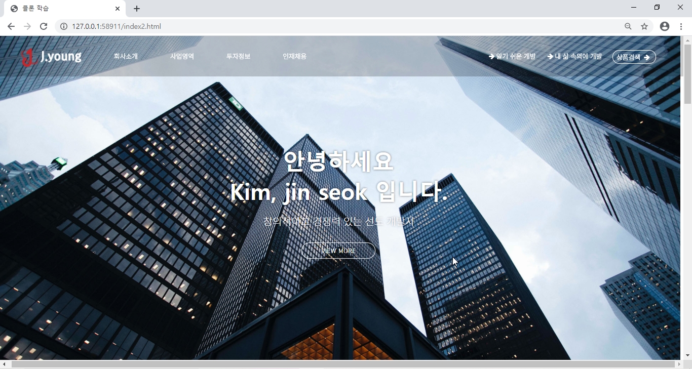
<h2 class="en">안녕하세요<br>Kim, jin seok 입니다.</h2>
<p>창의적이고 경쟁력 있는 선도 개발자</p>
<a href="#" class="view">view more<i class="fa fa-long-arrow-right" aria hidden="true"></i></a>
</div>
</section>
<!--section.about-->
<section class="about">
<div class="title">
<h2 class="en">ABOUT COMPANY<span>.</span></h2>
<p>대한민국을 대표하는 웹 개발자,<br class="mo">저를 소개합니다.</p>
</div>
<ul>
<li><a class="#"><p class="img"><img src="img/about_1.jpg" alt="회사소개"></p>
<div class="text">
<h3>회사소개</h3>
<p>삶의 가치를 높이는 개발기업</p>
<P class="more"><i class=" icon-right-big">more</i></P>
</div>
</a></li>
<li><a class="#"><p class="img"><img src="img/about_2.jpg" alt="회사소개"></p>
<div class="text">
<h3>중앙 시스템</h3>
<p>설립 이래 한결 같은 자세로 개발에 <br class="mo">전념해 오고있습니다.</p>
<P class="more"><i class=" icon-right-big">more</i></P>
</div>
</a></li>
<li><a class="#"><p class="img"><img src="img/about_3.jpg" alt="회사소개"></p>
<div class="text">
<h3>투자정보</h3>
<p>주요 경영사항을 제공합니다.</p>
<P class="more"><i class=" icon-right-big">more</i></P>
</div>
</a></li>
</ul>
</section>
<!--section.innovations-->
<section class="innovations">
<div class="title">
<h2 class="en">OUR PRODUCT innovations<span>.</span></h2>
<p>끊임없는 기술 혁신으로 미래 성장 동력을 지속 발굴 합니다.</p>
</div>
<div class="imgbox">
<div class="inner">
<h3 class="en">01<span>.</span>Chlorinated Polyvinyl Chloride</h3>
<div class="bottom">
<p>국내에서 처음으로 자체 기술로 CPVC를 생산하는데 성공하고 2017년 울산 2공장에 연산 3만톤 규모의<br class="clear">공장을 건설해 생산 중입니다.</p>
<a href="#">제품상세보기</a>
</div>
</div>
</div>
</section>
<!--section.me-->
<section class="me">
<div class="title">
<h2 class="en">CHALLENGE ME <span>.</span></h2>
<p>저와 함께 꿈을 키워 갈 기업을 기다립니다.</p>
</div>
<ul class="list">
<li>
<h3><span><i class=""></i></span>직무특성 및 소개</h3>
<p>한국 케미칼 산업의 역사를 이끌어 온 미래를 선도하는 글로벌 케미칼리더로 함께 성장해 나갈 인재를 모집합니다.<br>
글로벌 시장 진출 및 사업다각화가 본격화됨에 따라 체계적 · 전문적인 인재 육성의 중요성을 인식하고, 그에 걸맞은 다양한 교육프로그램과 인사제도를 폭넓게 실시하고 있습니다.</p>
<a href="#" class="more">more<span><i class=""></i></span></a>
</li>
<li>
<h3><span><i class=""></i></span>인재상</h3>
<p>한화는 신용과 의리에 기반하여 ‘도전, 헌신, 정도’를 3대 핵심가치로 삼는 인재상을 추구하고 있습니다.</p>
<ul class="in">
<li>
<em>Challenge</em><p>기존의 틀에 안주하지 않고 변화와 혁신을 통해 최고를 추구하는 도전적인 개발인</p>
</li>
<li>
<em>Dedication</em><p>회사, 고객, 동료와의 인연을 소중히 여기고 큰 목표를 위해 혼신의 힘을 다하는 헌신적인 개발인</p>
</li>
<li>
<em>Intergrity</em><p>자긍심을 바탕으로 원칙에 따라 바르고 공정하게 행동하는 정도의 개발인</p>
</li>
</ul>
<a href="#" class="more">more<span><i class=""></i></span></a>
</li>
</ul>
<button>개발인 채용사이트 바로가기</button>
</section>
<!-- section.sns-->
<section class="sns">
<div class="title">
<h2 class="en">SNS CHANNEL<span>.</span></h2>
<p class="en">SNS를 통해 다양한 <br class="mo">모습을 만나보세요.
</p>
</div>
<ul>
<li>
<a href="#"><p class="img"><img src="img/blog_1.png" alt=""></p>
<div class="bottom"> <p class="color">개발캐스트</p>
<p>웹에 숨결을 불어넣는 개발 기술</p>
<p class="time">2020.11.02 <span>08:10</span></p>
</div>
</a> </li>
<li>
<a href="#"><p class="img"><img src="img/blog_2.jpg" alt=""></p>
<div class="bottom"> <p class="color">뉴스</p>
<p>개발캐피털 중앙연구소, 친환경 업무 상황</p>
<p class="time">2020.11.15 <span>08:40</span></p>
</div>
</a> </li>
<li>
<a href="#"><p class="img"><img src="img/blog_3.png" alt=""></p>
<div class="bottom"><p class="color">동호회</p>
<p>개발자를 꿈꾸는 청소년들을 응원합니다!</p>
<p class="time">2020.09.02 <span>11:10</span></p>
</div>
</a> </li>
</ul>
</section>
<!-- footer-->
<footer>
<div class="inner">
<h2 class="ftlog"><img src="img/logo2.png" alt=""></h2>
<ul class="address">
<li>
03670 서울특별시 서대문구 증가로200-8 두산위브아파트 </li>
<li>
Copyright 2020.</li>
</ul>
<ul class="list">
<li><a href="#">온라인 구매시스템</a></li>
<li><a href="#">고객문의</a></li>
<li><a href="#">공지사항</a></li>
<li><a href="#">개인정보처리방침</a></li>
<li><a href="#">FAMILY SITE</a></li>
</ul>
</div>
</footer>
</div>
</body>
</html>
CSS
@charset "UTF-8";
@import url('https://fonts.googleapis.com/css2?family=Noto+Sans+KR:wght@100&display=swap');
*{margin:0; padding: 0;}
li{list-style: none; font-weight: bold;}
a{text-decoration: none; color: inherit;}

/*layout*/
.en{font-family: 'Exo 2', sans-serif;}
body{font-family: 'Noto Sans KR', sans-serif; font-size: 14px;}
.wrap{margin: 0 auto;}
#skip-nav{position: fixed; top:-41px; left: 0; width: 100%; line-height: 40px; background: #ff8342; color: #fff; text-align: center; border-bottom: #ff0000; transition: all 0.5s;}
#skip-nav:focus{top:0;}
header{position: fixed; top: 0; left: 0; width:100%; height: 100px; background: rgba(0, 0, 0, 0.2); line-height: 100px; z-index: 200;}
.innerhead{width: 1600px; margin: 0 auto; box-sizing: border-box; overflow: hidden;}/*오버플로워는 후에 나오는float때문에 상실된 width값을 복원하기 위한 것임*/
.innerhead .logo{float: left; padding-top: 15px;}
.innerhead .logo img{width: 100%; height: auto;}
.innerhead .gndmo{display: none;}
.innerhead .gnb{float: left; margin-left: 80px;}
.innerhead .gnb li{float: left; margin-right: 80px;}
.innerhead .gnb li a{width: 100%; height: 100%; display: block; text-align: center; color:#fff; font-size: 16px;}
.innerhead .gnb li a:hover, .innerhead .gnb li a:focus{color:#ff8342; transition: all 0.5s;}

.innerhead .tnb {float: right;}
.innerhead .tnb li{float: left; margin-right: 25px;}
.innerhead .tnb li a{display: block; width: 100%; height: 100%; text-align: center; font-size: 16px; color: #fff;}
.innerhead .tnb li:nth-child(1) a i, .innerhead .tnb li:nth-child(2)a i {font-size: 20px; margin-right: 8px;}
.innerhead .tnb li:last-child a{display: block; width: 105px; line-height: 2; border: 1px solid #fff; border-radius: 30px; margin-top: 35px;}
.innerhead .tnb li:last-child a i{margin-left: 5px;}
.innerhead .tnb li:last-child a:hover{background: #fff; color: #ff8342; transition: all 0.3s;}


/*section.main*/
section.main{width: 100%; height: 100vh; background: url(../img/vis_4.jpg)no-repeat center/cover; position: relative; background-attachment: fixed}
/*postion의 relative와 absoulute의 상관 관계 이해. 부모의 relative기준을 잡아야 자식이 absoulute이 적용되는 거다.*/
section.main .maintitle{position: absolute; top: 50%; left: 50%; transform: translate(-50%,-50%); color: #fff; text-align: center; text-shadow: 0 0 5px rgba(0, 0, 0, 0.5); animation-name: maintitle; animation-duration: 1s;}
@keyframes maintitle{
0%{opacity: 0; top: 60%;}
30%{opacity: 0; top: 60%;}
100%{opacity: 1; top: 50%;}
}
section.main .maintitle h2{font-size: 55px; margin-bottom: 20px;}
section.main .maintitle p{font-size: 25px; margin-bottom: 35px;}

section.main .maintitle .view{display: block; width: 180px; margin: 0 auto; padding: 8px 0; text-transform: uppercase; font-size: 15px; letter-spacing:1px; border: 1px solid #fff; border-radius: 40px; position: relative; overflow: hidden;}
section.main .maintitle .view:after{content: ""; width: 0; height: 100%; background: rgba(255, 255, 255, 0.48); left: 0;top: 0; position: absolute;}
section.main .maintitle .view:hover:after{width: 100%; transition: all 0.3s;}


/*section title*/
section .title {color: #000; text-align: center;}
section .title h2{font-size: 45px; margin-bottom: 5px; font-weight: normal;}
section .title h2 span{color:#ff8342;}
section .title p{font-size:18px; color: #555;}


/*section.about*/
.mo{display: none;}
section.about ul{margin: 30px auto; width: 1400px; border-bottom: 1px solid #ddd; overflow: hidden;}
section.about ul li{float:left; width: 33.3333%;}
section.about ul li a{display: block; width: 100%; height: 100%;}
section.about ul li a p.img{width:100%; height: 369px; overflow: hidden;}
section.about ul li a p.img img{width:100%; height: auto; transition: all .8s;}
section.about ul li a:hover p.img img,section.about ul li a:focus p.img img{transform: scale(1.2); transition: all 1s;}
section.about ul li a .text{padding: 30px;}
section.about ul li a h3{font-size: 20px; margin-bottom: 10px;}
section.about ul li a p{font-size: 16px; margin-bottom: 10px;}
section.about ul li a p.more{text-transform: uppercase; margin-left: 40px; font-weight: bold;}


/*section.innovations*/
section.innovations{margin-bottom: 150px;}
section.innovations .imgbox{width: 1400px; height: 540px; margin: 50px auto 0; background: url(../img/product_1.jpg) no-repeat center/cover; position: relative;}
section.innovations .imgbox .inner{background: #3a3c4e; position: relative; width: 80%; left: 50%; transform: translateX(-50%); bottom: -400px;}/**/
section.innovations .imgbox .inner h3{background: #fff; padding: 25px 45px; box-sizing: border-box; font-size: 18px;} /*padding을 주면 부모의 영향을 받기 때문에 box-sizing: border-box;을 줘야 움직이지 않는다.*/

section.innovations .imgbox .inner h3 span{color:#ff8342;}
section.innovations .imgbox .inner .bottom{padding: 35px 85px; box-sizing: border-box; color: #fff; overflow: hidden; line-height: 1.6;}
section.innovations .imgbox .inner .bottom p{float: left;}
section.innovations .imgbox .inner .bottom a{float:right; padding:  7px 30px; background: #ff8342; border-radius: 50px;}
section.innovations .imgbox .inner .bottom a:hover,section.innovations .imgbox .inner .bottom a:focus{background:#f86010;}

/*section.me*/

section.me{margin-bottom: 150px; padding: 80px 0; background: url(../img/me.jpg)no-repeat center/cover;}
section.me ul.list{width: 1400px; margin: 50px auto; border-top: 2px solid #000; border-bottom: 2px solid #000;}
section.me ul.list > li{padding: 30px 60px; box-sizing:border-box;}/*자식에 padding을 주면 부모 width의 폭안으로 적절히 들어가기 위해 자식에 box-sizing:border-box;를 줘야한다.*/
section.me ul.list > li:nth-child(1){border-bottom: 1px solid #ddd;}/* '>'는 list안에 있는 li만 주겠다는 것이다.*/
section.me ul.list li h3{font-size: 18px; margin-bottom: 20px; position: relative;}/**/
section.me ul.list li h3 span{position: absolute; left: -35px; color: #ff8342;}/**/
section.me ul.list li > p {line-height: 1.6; margin-bottom: 20px;}/**/
section.me ul.list li > a {display: inline-block; font-weight: bold; line-height: 1.6; font-size:16px;}
section.me ul.list li  >a span {color:#ff8342; font-weight: bold; margin-left: 3px; font-size: 14px;}

section.me ul.in{margin-bottom: 30px;}
section.me ul.in li{margin-bottom: 10px; overflow: hidden;}/**/
section.me ul.in li em{float: left; width: 12%; font-weight: bold;}/**/
section.me ul.in li p{float: left; width: 88%; position: relative;}/**/
section.me ul.in li p:before {content: ''; position: absolute; left: -40px; top: 10px; width: 4px; height: 4px; border-radius: 50%; background:#ff8342;}/**/

section.me button{display: block; width: 280px; background:#ff8342; border: none; padding: 10px 0; font-weight: bold; text-align: center; margin: auto; border-radius: 50px; color:#fff;}


/*sectin.sns*/

section.sns{margin-bottom: 60px;}
section.sns ul{width: 1400px; margin: 50px auto; overflow: hidden;}
section.sns ul li{float:left; width: 32%; margin-right: 1%;}
section.sns ul li:last-child{margin-right: 0;}
section.sns ul li a{display: block; width: 100%; height: 100%;}
section.sns ul li a p.img{height: 251px; overflow: hidden; position: relative;}
section.sns ul li a p.img:before{content:''; width:0%; height:100%; position:absolute; left: 0; top: 0; background: rgba(255, 131, 66, 0.9); transition: all 0.6s;}
section.sns ul li a p.img img{width: 100%;}
section.sns ul li a:hover p.img:before,section.sns ul li a:focus p.img:before {width: 100%; transition: all 0.6s;}
section.sns ul li a p.img:after{content:'BLOG'; position: absolute; left: 50%; top: 50%; transform: translate(-50%,-50%); font-family: 'Exo 2', sans-serif; font-size: 15px; color: #fff; border: 1px solid #fff; border-radius: 40px; padding: 5px 30px; opacity:0; transition: all 0.5s;}
section.sns ul li a:hover p.img:after,section.sns ul li a:focus p.img:after{opacity: 1; transition: all 0.5s;}
section.sns ul li a .bottom{width: 100%; padding: 20px 0 20px 30px; box-sizing: border-box;}
section.sns ul li a .bottom p{font-weight: bold; font-size: 18px;}
section.sns ul li a .bottom p.color{color: #ff8342; font-weight: normal; font-size: 15px;}
section.sns ul li a .bottom p.time{color: #999; font-weight: normal; font-size: 15px; padding-left: 20px; margin-top: 30px; position: relative;}
section.sns ul li a .bottom p.time:before{}

/*footer*/

footer{clear: both; border-top: 1px solid #999; padding: 30px 0 50px;}
/*clear: both는 위의 section.sns부분의 flot의 영향을 받지 않기 위한 것이다.*/
footer .inner{width: 1600px; margin: 0 auto; background: }
footer .inner .ftlog{float: left;}
footer .inner .address{float: left; margin-left:100px; margin-top: 10px; }
footer .inner .address li:first-child{font-weight: bold; margin-bottom: 10px;}
footer .inner .address li:last-child{color: #999;}

footer .inner .list{float: right; font-family: 'Exo 2', sans-serif; margin-top: 10px; }
footer .inner .list li{float: left; margin-left: 80px;}
footer .inner .list li a{display: block; width: 100%; height: 100%; position: relative;}
footer .inner .list li a:after{content:''; width: 4px; height: 4px; border-radius: 50%; background: #ccc; position: absolute; right: -50px; top: 10px;}
footer .inner .list li a:hover,footer .inner .list li a:focus{color: #ff8342; text-decoration: underline;}
footer .inner .list li a:last-child{font-weight: bold; font-family: 'Exo 2', sans-serif; }

/*1599*/
    @media screen and (max-width:1599px){
    header .innerhead{width: 95%; min-width:1024px;}
    .innerhead .gnb {margin-left: 50px;}
    .innerhead .gnb li{margin-right: 40px;}
    .innerhead .gnb li:last-child{margin-right:0;}
    .innerhead .tnb li{margin-right: 10px;}
    section.about ul,section.innovations .imgbox,section.me ul.list,section.sns ul{width: 95%;}
    footer .inner{width: 95%; min-width: 90%}
    footer .inner .list li{margin-left: 20px;}
    footer .inner .list li a:after{right: -13px;}
}
/*태블릿모드 1024*/
@media screen and (max-width:1024px) {
    header .innerhead {width: 95%; min-width: 90%;}
    .innerhead .gnb, .innerhead .tnb {display: none;}
    .innerhead .gndmo {display: block; color: #fff; font-size: 40px;float: right;}
    section.main .maintitle {width: 80%;}
    section.me {margin-bottom: 50px; }
    section.me ul.in li p:before {left: -20px;}
    section.me ul.in li {margin-bottom: 0;}
    section.me ul.list li > p {margin-bottom: 10px;}
    section.sns ul li {width: 32.2%; margin-right: 1.7%;}
    footer .inner .list {display: none;}
}


/*테블릿모드 768*/
@media screen and (max-width:768px) {
    section.main .maintitle h2 {font-size: 40px;}
    section.main .maintitle p {font-size: 20px;}
    section.about {padding: 50px 0;}
    section.about ul li {width: 100%;}
    section.about ul li a p.img{height: 580px;}
    section.innovations .imgbox .inner h3 {padding: 20px;}
    section.innovations .imgbox .inner .bottom {padding: 30px;}
    section.innovations .imgbox .inner .bottom p .clear {display: none;}
    section.innovations .imgbox .inner .bottom p{float: none; margin-bottom: 30px;}
    section.innovations .imgbox .inner .bottom a {float: none; margin-left: 32%;}
    section.me {padding: 50px 0; margin-bottom: 80px;}
    section.me ul.in li em {display: block; float: none; width: 100%; font-size: 17px; margin-bottom: 5px;}
    section.sns ul li {width: 100%;}
    section.sns ul li a p.img{height: 380px;}
    footer .inner .ftlog {float: none; width: 100%; text-align: center;}
    footer .inner .address {float:none; width: 100%; box-sizing: border-box; margin-left:5%;}
    footer .inner .address li:last-child {margin-left: 40%;}
}
 /*태블릿모드 414*/
    @media screen and (max-width:414px) {
         header {height: 60px; line-height: 60px;}
        .innerhead {height: 100%; line-height: 60px;}
        .innerhead .logo {padding-top: 5px;}
        section.main .maintitle h2 {font-size: 30px;}
        section.main .maintitle p {font-size: 16px;}
        section.main .maintitle .view {width: 150px; font-size: 14px;}
        section .title h2 {font-size: 25px;}
        section .title p {font-size: 14px;}
        section.about {padding: 30px 0;}
        section.about ul {border-bottom: none;}
        section.about ul li a {border: 1px solid #ddd; box-sizing: border-box; background: #fafafa; margin-bottom: 10px;}
        section.about ul li a .text p.more {display: none;}
        section.innovations .imgbox .inner .bottom a {margin-left: 20%;}
        section.me ul.list > li {padding: 20px 0 20px 45px; }
        footer .inner .address {margin-left: 2%;}
        footer .inner .address li:last-child {margin-left: 39%;}
    }
/*모바일 모드 320*/
    @media screen and (max-width:414px) {
        br.mo {display: block;}
        .wrap {min-width: 320px;}
        header .innerhead{min-width: 320px;}
        .innerhead .logo {width: 140px; height: auto;}
        .innerhead .gndmo {margin-right: 10px;}
        section.main .maintitle h2 {font-size: 22px;}
        section.main .maintitle p {font-size: 14px;}
        section.about {padding: 10px 0;}
        section.about ul li a p.img {height: 200px;}
        section.about ul li a .text {padding: 15px;}
        section.about ul li a .text h3{font-size: 18px; margin-bottom: 5px;}
        section.sns ul li a p.img{height: 200px;}
        section.about ul li a .text p {font-size: 15px;}
        section.innovations .imgbox .inner .bottom a{margin-left: 18px;}
                footer .inner .address li:last-child {margin-left: 27%;}
}
상상했던 것 보다 무척 오래걸렸던 것 같다. 웹 페이지 하나에 이렇게 많은 노력이 들어가는지 뼈저리게 느낀 학습이었다. 일단 블로그에 이렇게 올려놓고 시간 날 때마다 틈틈히 들어와 한 줄 한 줄 분석하며 다시 복습해야겠다.
반응형
'프로그래밍 개발 > CSS' 카테고리의 다른 글
| HTML CSS (feat. jQuery) 간단한 포트폴리오 웹 사이트 코딩. (0) | 2020.10.27 |
|---|---|
| CSS 폰텔로 fontello 활용하기 (0) | 2020.10.26 |
| CSS 코드 경량화 minify (0) | 2020.10.26 |
| CSS link와 import를 이용한 유지 보수 (0) | 2020.10.26 |
| CSS 그래픽 - background, filter, transform, transition (0) | 2020.10.22 |


댓글